
High-Converting Landing Pages: UX Mistakes, Banner Blindness, and Psychological Principles

A high-converting landing page serves as the sharpest point of your customer acquisition pipeline. It is the destination where paid advertising spend, targeted search campaigns, and strategic copywriting must align to drive a single, calculated conversion action. Despite the critical importance of these standalone promotion hubs, many organizations deploy landing layouts that fail to convert high-intent traffic. They invest heavily in buying ad clicks, only to route that traffic into cluttered, slow-loading templates that frustrate users and drive down marketing performance.
When an interface features a chaotic visual hierarchy, users drop off instantly. Visitors do not spend time deciphering confusing navigation systems, unoptimized text blocks, or flashing banner promotions; they leave and return to their search results. This user abandonment is not a failure of marketing intent; it is a direct failure of user experience (UX) architecture. To stop wasting ad spend, you must treat landing page design as a precise science that combines technical speed with human behavioral psychology.
Fixing these performance bottlenecks requires moving past superficial design templates and engineering custom layouts that match how humans scan digital content. This is why automated algorithms struggle to replicate human-centric copywriting and UX compared to bespoke development. Deploying lightweight, hand-coded architectures ensures your promotion pages load instantly while guiding users naturally toward transaction steps. This strategic approach transforms temporary campaign traffic into long-term customer equity, maximizing overall marketing value.
Deconstructing the Psychology of Visual Attention
Human beings browse digital content using rapid visual scanning behaviors to conserve cognitive energy. When a prospect arrives on a landing layout, their brain immediately seeks to resolve two primary questions: What solution is being offered here? and What specific step should I take next? If your layout requires users to dig through block text or scan multiple competing columns to find these answers, the cognitive load spikes, causing them to leave the page.
To capture attention before users scroll away, your key marketing message must live in the upper viewport—the area visible on a screen before a visitor scrolls down. This header area must feature a clear, compelling headline and a single, obvious call-to-action button. By removing secondary navigation links, social media feeds, and extra footer menus, you create an isolated environment that keeps users entirely focused on your primary conversion goal.
Every design choices must support a clear, focused conversion strategy. Combining an optimized text structure with an intentional color scheme is critical for building deep user confidence. Aligning your layout blocks with the psychology of color palettes that build trust ensures your interface remains fully accessible while reinforcing your brand authority.

Overcoming Banner Blindness and Visual Saturation
A common mistake in landing page construction is the over-use of flashing accent colors, competing icons, and loud promotional boxes. While amateur developers add these elements to capture attention, they trigger an unintended behavioral response known as banner blindness. Because consumers are exposed to thousands of intrusive online ads daily, their brains have adapted to automatically ignore any element that resembles an advertisement or a generic promotional banner.
When you clutter a page with colorful blocks, security badges, and flashing buttons, your high-intent users become overwhelmed and overlook your main conversion links. To bypass this mental filter, your interface must use high-contrast accents sparingly. Restricting your vibrant brand colors exclusively to primary checkout or signup fields makes those buttons stand out naturally against a clean, minimal backdrop.
Engineering Text Layouts for Better Conversions
To maintain strong engagement as users scroll down your page, your written layout must match natural human scanning paths. Placing text blocks hierarchly across an open layout disrupts reading flow, causing users to drop off early.
Your core messaging must be easy to read and highly scannable; pairing a clean page framework with high-converting website copy architecture ensures your headlines and value propositions capture attention effortlessly. Every line of text should guide the user smoothly toward your final conversion steps.
Quantitative Comparison: Landing Page Architectures and Conversion Metrics
The under-the-hood technology stack you select to host your promotional pages directly impacts your campaign performance and user retention profiles.
| UX Evaluation Variable | Automated Page Builder Systems | Custom Coded UI Frameworks |
|---|---|---|
| Initial Interaction Latency | High; delayed by unoptimized script bundles and heavy layouts | Zero; loads instantly via lean HTML and inline CSS |
| Visual Stability (CLS Metric) | Poor; layout elements shift awkwardly as scripts render | Perfect; absolute layout stability prevents misclicks |
| Interactive Layout Focus | Cluttered; distracted by generic template limitations | Isolated; tailored explicitly to a single conversion goal |
| Form Processing Efficiency | Dependent on slow third-party API plugin integrations | Native; processes user submissions instantly and safely |
| Multi-Device Compatibility | Prone to broken elements on non-standard phone viewports | Flawless; uses clean media queries for all devices |

The Financial Impact of Performance Bottlenecks
A beautiful landing page layout cannot convert users if it suffers from high loading latency. When an enterprise launches a paid ad campaign, every click costs marketing capital. If your underlying site architecture takes longer than two seconds to parse assets, mobile bounce rates spike rapidly. You end up paying for ad clicks that never yield a real customer interaction, destroying your advertising returns.
To ensure your promotional funnels operate with maximum efficiency, you must eliminate third-party code bloat completely. Deployed custom architecture runs directly on the server without processing heavy plugin modules or subscription frameworks. Choosing a clean, hand-coded web architecture over page builders guarantees your campaign pages load instantly, helping you lower customer acquisition costs and boost overall marketing returns. Investing in a premium, custom-engineered user journey is a proven method for improving capital efficiency, as outlined in our study on how great user experience lowers customer acquisition costs.
To see how technical architecture controls page speed and conversion tracking, look at how an expert code block structures a high-converting form compared to a page builder. A professional structures a lean, accessible form:
+───────────────────+        +───────────────────+        +───────────────────+
│   User Click      │ ─────► │ Lean HTML Form    │ ─────► │ Direct Native API │
│   (Ad Traffic)    │        │ (Instant Load)    │        │ (Zero Latency)    │
+───────────────────+        +───────────────────+        +───────────────────+
                                       │                            │
                                       ▼                            ▼
                             [ Perfect Stability ]        [ High Conversion ]
Conversely, a template framework loops through heavy nested containers to load identical inputs:
+───────────────────+        +───────────────────+        +───────────────────+
│   User Click      │ ─────► │ Nested Elements   │ ─────► │ Heavy Script Loops│
│   (Ad Traffic)    │        │ (Layout Shifting) │        │ (Delayed Loading) │
+───────────────────+        +───────────────────+        +───────────────────+
                                                                    │
                                                                    ▼
                                                          [ User Abandonment ]
This excessive nesting creates code bloat, slows down rendering times on mobile screens, and introduces tracking bugs into your advertising pixels.
Behavioral Science: Leveraging Friction and Social Proof
Building a high-converting page requires using behavioral science to guide user decisions. Your interface must reduce friction while adding specific psychological indicators that validate your brand's authority.
- Strategic Cognitive Friction: While reducing form fields usually boosts registrations, adding a specific qualifying question can screen out low-quality leads, ensuring your sales team focuses exclusively on high-value prospects.
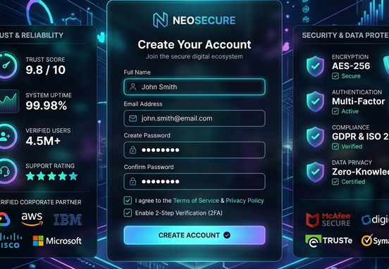
- Contextual Social Proof: Place customer testimonials and corporate logos directly adjacent to your signup buttons, reassuring users right at the point of transaction.
- Quantitative Trust Markers: Use real, measurable performance data (e.g., "$12\text{M}+$" in transactions processed") rather than vague marketing buzzwords to build deep credibility.
- Scarcity and Temporal Triggers: Emphasize real deadlines or limited availability to encourage immediate action, preventing prospects from delaying their decision.
Operational Conversion Standard: Never route paid marketing traffic into a generic homepage layout. Homepages are designed for broad exploratory browsing; a high-performing ad campaign demands a dedicated, single-focus landing page engineered to drive one specific business outcome.
To protect your conversion rates, your promotional layouts must be supported by clean mobile optimizations. Ensuring your site features fast loading times, large touch targets, and stable vertical columns prevents interface bugs from stalling your growth. Reviewing our technical guide on mobile-first design core principles and troubleshooting layout consistency provides your engineering teams with the necessary insights to keep your mobile campaigns running smoothly.
Investing in expert web engineering ensures your platforms remain fast, secure, and perfectly tailored to your target customer journeys. Our professional web design and development services are built to remove technical bloat and deliver highly polished custom applications. Investing in premium development allows your company to bypass generic template limits, eliminate platform dependencies, and build a resilient digital presence that drives sustainable, long-term market growth.