

The Psychology of Color: Choosing a Palette That Builds Trust

Visual judgment takes less than 90 seconds when a user first interacts with a digital asset. Within that short window, up to 90% of their initial assessment is based entirely on color choices alone. For a scaling enterprise, choosing a corporate color scheme is not a matter of personal taste or creative whim. It is an intentional engineering choice that directly alters user behavior, lowers cognitive friction, and defines your brand's market credibility before a single line of text copy is read.
When you launch an online storefront or a B2B platform, you are asking visitors to trade their capital, private data, and time for your corporate solutions. If your visual palette feels chaotic, overly saturated, or misaligned with industry expectations, users experience an immediate, subconscious resistance. This subtle visual friction causes users to abandon their sessions early, turning your marketing spend into wasted customer acquisition capital.
Chromatic Architecture and Subconscious Consumer Friction
The human brain relies on visual shortcuts to categorize information and assess risk. In digital environments, color serves as the foundational layer of this shortcut system. A chaotic or poorly balanced layout signals an unpolished operation, while a disciplined, intentional palette conveys stability, experience, and authority. This psychological validation is critical for separating elite enterprises from amateur projects.
Many organizations treat visual planning as a minor cosmetic step, ignoring how deeply color choices interact with other brand elements. Selecting a cohesive palette must happen in tandem with building a comprehensive brand identity. Relying on generic, mass-market visual shortcuts is highly counterproductive; understanding why a cheap online icon is not enough to build a real brand identity reveals how superficial design choices actively degrade consumer trust and market positioning.
To design an interface that captures and converts high-intent users, you must understand how different color weights affect neurological processing. Every tone, tint, and shadow in your interface should serve a specific functional purpose within your user acquisition funnel.

Decoding the Corporate Trust Spectrum
Different colors trigger distinct cognitive associations based on cultural patterns and psychological conditioning. Understanding these core associations allows your engineering teams to choose tones that match your specific operational goals.
| Chromatic Core | Psychological Triggers | Optimal Corporate Vertical | Strategic Risk Factors |
|---|---|---|---|
| Deep Navy & Slate Blue | Systemic trust, security, institutional stability, calm precision | Financial technology, legal counsel, enterprise SaaS, corporate healthcare | Can feel overly cold or distant if not paired with warm neutral tones |
| Pure Charcoal & Off-Black | Premium value, high authority, sophisticated luxury, structural strength | High-end consulting, elite architecture, premium consumer tech | Prone to creating severe visual fatigue if contrast ratios are misaligned |
| Forest Green & Sage | Sustainable growth, fiscal health, operational safety, equilibrium | Wealth management, agricultural tech, corporate compliance platforms | Risk of looking amateurish if saturation levels are unoptimized |
| Crisp White & Minimal Light Gray | Absolute transparency, structural clarity, modern efficiency | Healthcare portals, enterprise analytics engines, cloud databases | Can feel clinical and uninviting without intentional accent colors |
The Dominance of Strategic Blue and Neutrals
There is a clear technical reason why dominant technology firms and financial systems use blue tones across their primary digital platforms. Darker blue tones operate at a stable wavelength that feels calming to the human eye, reducing cognitive fatigue during extended viewing sessions. This calm state is essential for keeping users focused when they interact with complex dashboards, multi-step checkouts, or deep data paths.
However, using a trustworthy primary tone is only effective if the surrounding layout feels clean and balanced. The impact of your color scheme is deeply tied to your choice of typography and overall content structure. Combining an expert palette with disciplined typography and font configurations is critical for ensuring your interface reflects your real-world value and maintains a premium digital presence.
The Neurobiology of Visual Fast-Processing
Human eyes process visual stimuli through specialized photoreceptor cells that translate light wavelengths into chemical signals for the brain. High-saturation, neon primary tones force these cells to work harder, causing physical eye strain over time. When a corporate website uses overly bright background colors, it causes physical discomfort that encourages users to exit the page.
Professional digital design balances these wavelengths by using muted base tones mixed with strategic highlight colors. This engineering standard ensures that long-form data displays remain comfortable to read over long periods. Keeping your users physically comfortable while they browse your site helps build a more positive relationship with your brand.
The Technical Execution of Visual Accessibility
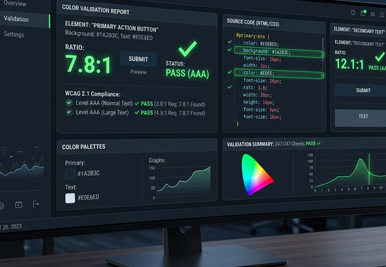
A beautiful color scheme is useless if your target audience struggles to navigate your interface. True design expertise requires balancing psychological color theory with strict digital accessibility standards. The Web Content Accessibility Guidelines (WCAG) mandate specific contrast ratios to ensure content remains entirely legible for all users, including those with visual impairments.
For standard body text, a minimum contrast ratio of 4.5:1 against the background is required, while larger heading elements must hit at least 3:1. Amateur platforms often ignore these requirements to chase trendy, low-contrast designs, such as light gray text on white backgrounds. This choice directly compromises usability and exposes your business to regulatory compliance risks.
A professionally engineered layout implements these contrast parameters directly into the core design system. To see how an elite development framework handles accessible theme variables, review this sample CSS configuration for a highly accessible, trust-centered theme palette:
+-------------------------------------------------------+
|                 USER LANDS ON PLATFORM                |
+-------------------------------------------------------+
                            |
                            | (Within 90 Seconds: 90% of Visual Judgment)
                            v
+-------------------------------------------------------+
|          SUBCONSCIOUS CHROMATIC PROCESSING            |
+-------------------------------------------------------+
                            |
                            v
+-------------------------------------------------------+
|             THE 60-30-10 VISUAL ARCHITECTURE          |
|                                                       |
|  [60% Dominant Canvas]  --> Base Mood & Anti-Glare    |
|  [30% Secondary Depth]  --> Navigation & Core Text    |
|  [10% Intentional Accent] -> High-Contrast CTA Trigger |
+-------------------------------------------------------+
                            |
                            | (WCAG Compliance Check: 4.5:1 / 3:1 Contrast)
                            v
+-------------------------------------------------------+
|             ACCESSIBLE CONVERSION FUNNEL              |
+-------------------------------------------------------+
                            |
                            | (Eliminates Banner Blindness)
                            v
+-------------------------------------------------------+
|             HIGH-INTENT USER CONVERSION               |
+-------------------------------------------------------+
Using clear, semantic design tokens ensures your application looks consistent across all screen sizes and prevents layout rendering errors. This disciplined code execution guarantees your brand values remain perfectly visible on every device viewport.
The 60-30-10 Rule in Conversion Architecture
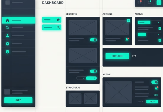
To build deep consumer trust, your website must maintain a clear, predictable visual hierarchy. Design specialists achieve this balance by using the 60-30-10 rule, a spatial distribution standard that prevents visual chaos and guides users toward key conversion steps.
- 60% Dominant Tone: This color forms the canvas of your application. It typically consists of clean white, soft off-white, or deep dark grays, establishing the primary visual mood without overwhelming the user.
- 30% Secondary Structure: This tone creates structural depth. It is used for sidebars, cards, navigation bars, and primary text, grounding your interface elements cleanly.
- 10% Intentional Accent: Reserved exclusively for high-value interactive elements. This vibrant, high-contrast color highlights phone numbers, booking links, and transaction buttons, capturing focus instantly.
Eliminating Banner Blindness with High-Contrast Accents
When accent colors are overused across non-essential elements, your interface loses its conversion focus. Users develop banner blindness, a subconscious habit of ignoring highlighted areas because of visual clutter. Keeping your accent color restricted to critical action steps ensures your primary conversion paths remain highly effective.
This precise visual engineering is essential for building high-converting landing pages, ensuring that psychological design principles work smoothly alongside clean code to lower bounce rates and maximize user interactions. Every color choice must support your core messaging; combining a balanced layout with crafting high-converting website copy ensures your value propositions build immediate user trust and drive conversions.
Environmental Considerations: Dark Mode and Energy Efficiency
Modern interface engineering must also account for the physical environments where users access your application. Offering a well-designed dark mode is no longer just a cosmetic preference; it is an important usability feature for users browsing in low-light settings. Dark mode reduces blue light exposure and minimizes eye strain during evening hours.
From an infrastructure perspective, dark interfaces can improve energy efficiency on devices with OLED and AMOLED screens. Because these displays power down individual pixels to show pure black tones, an optimized dark interface uses less battery power. This technical optimization improves the user experience and helps keep users engaged with your platform longer.
Pitfalls of Amateur Palettes and Platform Limitations
Many growing businesses fall into the trap of using generic templates or default page builder setups that offer pre-packaged color themes. These automated design choices often use overly saturated primary colors or generic color pairings that fail to communicate real corporate expertise. This lack of visual polish can cause potential clients to question your brand's legitimacy.
To escape these design limits, your enterprise requires an independent digital architecture built tailored precisely to your strategic goals. Custom design means your brand values dictate the interface layout, rather than your marketing team being forced to work around the rigid constraints of a generic template.
Design Governance Standard: Never let automated software builders select your brand color values. Every hex code used in your digital application must be chosen intentionally to match your real-world positioning and tested across multiple device screens to ensure perfect color accuracy and absolute compliance.
Securing expert engineering ensures your digital platforms remain accessible, performant, and perfectly tailored to your target customer journeys. Our professional web design and development services are built to remove technical bloat and deliver highly polished custom applications. Investing in premium, custom-coded digital assets ensures your company avoids generic design traps, strengthens market authority, and builds a sustainable digital presence that drives long-term conversion growth.