

Mobile-First Web Design: Core Principles and Troubleshooting Layout Consistency for Smartphones

Mobile devices account for over sixty percent of global web traffic, making smartphone optimization the absolute baseline for commercial web engineering. Despite this clear shift in consumer behavior, many organizations treat mobile layout planning as a secondary step. They design an expansive desktop viewport first, then attempt to shrink, compress, and hide elements to force the interface into a vertical phone screen. This legacy approach is a major operational error that creates broken layouts, erratic navigation, and high bounce rates.
True mobile-first engineering reverses this workflow by designing for the most restricted interactive canvas first. By solving the challenges of screen real estate, limited touch targets, and varying mobile bandwidth speeds at the foundational level, you build a lean digital asset. This core optimization naturally scales upward to larger tablet and desktop viewports without carrying unnecessary code weight or performance liabilities.
When a corporate platform exhibits broken layouts on modern smartphones, it instantly destroys brand authority and halts lead generation pipelines. High-intent mobile users demand instant, intuitive navigation; if they encounter overlapping text, unresponsive links, or horizontal scrolling bugs, they exit your site immediately. Implementing strict mobile-first engineering standards protects your marketing spend and ensures your digital channels convert mobile traffic efficiently.
The Structural Core of Mobile-First Layout Engineering
Designing for smartphones requires a complete shift in how code and visual content are structured. On a desktop screen, layouts expand horizontally across multiple columns; on a mobile device, content must flow down a disciplined vertical path. This layout style demands absolute prioritization of content hierarchy. Non-essential decorative blocks, heavy background graphics, and secondary text sections must be removed or repositioned to keep the user journey clear and fast.
The core foundation of this vertical workflow is the viewport meta tag, an essential script inserted into the document header. This code tells the smartphone's browser to map the layout directly to the physical screen width of the device, rather than attempting to render a wide desktop layout in a tiny preview box. Without this tag, mobile browsers will shrink your site to a microscopic scale, making it completely unusable without manual zooming.
To see why mobile-first layouts remain stable across different screen sizes, we can analyze how a professional configures fluid CSS grid structures versus how an unoptimized layout breaks. A professional writes clean, mobile-first media queries that expand as screen sizes grow:
+---------------------------------------+
|  MOBILE-FIRST FOUNDATION (<768px)     |
|  [ .corporate-card-grid ]             |
|  - 1 Column Layout (1fr)              |
|  - Gap: 16px | Padding: 12px          |
+---------------------------------------+
                    |
                    v  @media (min-width: 768px)
+---------------------------------------+
|  TABLET VIEWPORT EXPANSION            |
|  - 2 Column Layout (repeat(2, 1fr))   |
|  - Gap scales up to 24px              |
+---------------------------------------+
                    |
                    v  @media (min-width: 1024px)
+---------------------------------------+
|  DESKTOP VIEWPORT EXPANSION           |
|  - 3 Column Layout (repeat(3, 1fr))   |
|  - Inherits 24px gap layout           |
+---------------------------------------+
This approach ensures the application remains light and performant on mobile devices, loading only the necessary positioning scripts. Conversely, legacy website builders frequently degrade mobile performance by hardcoding absolute pixel widths (width: 1200px;), which forces the page layout to break and introduces awkward horizontal scrolling on smaller mobile viewports.

Troubleshooting Common Mobile Layout Structural Failures
Even with a fluid grid setup, mobile layouts can break due to unoptimized content assets or bad styling choices. Resolving these layout errors requires systematic debugging of your CSS properties and HTML containers.
Eradicating the Horizontal Overflow Defect
The most common mobile layout bug is the horizontal scroll error, where users can slide the page sideways, revealing empty white margins. This issue occurs when an element inside a container is given a fixed width that exceeds the physical screen width of the mobile device.
To track down and eliminate horizontal overflow bugs, look for unoptimized images, absolute pixel dimensions, or long text strings that cannot break naturally. Applying a global safety reset within your primary stylesheet helps isolate and prevent container leakage:
+-----------------------------------------+
| GLOBAL RESET: *, *::before, *::after    |
| -> box-sizing: border-box               |
+-----------------------------------------+
                    |
                    v (Applies Core Constraints)
+-----------------------------------------+
| VIEWPORT CONTAINMENT: html, body        |
| -> max-width: 100%                      |
| -> overflow-x: hidden                   |
+-----------------------------------------+
                    |
                    v (Final Output)
+-----------------------------------------+
| HORIZONTAL OVERFLOW ELIMINATED          |
| -> Secures horizontal plane safely      |
+-----------------------------------------+
Resolving Overlapping Typography and Tap Target Collisions
When desktop typography layouts are scaled down for mobile screens without adjusting line heights, headline fonts often overlap, making the content unreadable. Similarly, button elements placed too close together cause touch accidents, where users tap the wrong link due to limited spacing.
To prevent tap collisions, ensure all links, buttons, and form inputs maintain a minimum physical target size of 48 by 48 pixels, with plenty of surrounding space. This design spacing accommodates natural touch behaviors smoothly, reducing user frustration during key interactions.
Building a seamless user experience on mobile screens directly reduces your overall customer acquisition costs. When a mobile interface responds instantly and cleanly, users stay engaged longer and move through your conversion pathways more efficiently. Investing in specialized mobile layout engineering is a proven strategy for maximizing marketing efficiency, as explained in our analysis of how great user experience lowers customer acquisition costs.
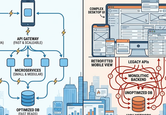
System Metrics: Mobile-First vs. Responsive Retrofitting
To properly evaluate your mobile strategy, your team should compare the differences between true mobile-first development and the legacy practice of retrofitting desktop templates.
| Engineering Lifecycle Attribute | Legacy Desktop-First Retrofitting | True Mobile-First Architecture |
|---|---|---|
| Initial Asset Payload Size | Large; downloads desktop files and attempts to hide them | Ultra-light; downloads only essential mobile scripts |
| Core Web Vitals Compliance | Consistently poor due to heavy layout shifting and code bloat | High; fast rendering times on standard mobile networks |
| Tap Target Precision | Poor; miniature desktop links that require pinch-zooming | High; large interactive zones optimized for natural touch |
| Interface Maintenance Overhead | High; requires endless media query patches to fix layout bugs | Minimum; clean base styles that scale up naturally |
| Search Engine Performance | Depressed due to modern mobile-first indexing penalties | Optimized; highly favored by crawling algorithms |
Navigating the Search Index Shift to Mobile Assets
Search engines now evaluate the mobile version of your website as the primary master file for indexing and ranking determinations. If your smartphone layout is missing core content, lacks proper structured schemas, or suffers from slow loading times, your entire web platform will be penalized across search engine results pages.
This indexing update means that hiding important business content or data sheets on mobile viewports to clean up the design can severely damage your search visibility. Your mobile site must contain the exact same schema data and critical content as your desktop view, packed into an optimized vertical layout.
Eliminating Technical Performance Drops
A mobile site that features a beautiful design but suffers from high latency will struggle to rank competitively. Heavy background scripts, unoptimized animations, and cluttered template frameworks slow down browser rendering on standard mobile devices, hurting your core user performance metrics.
Transitioning to high-performance web design and development services removes these technical barriers by building lean, lightning-fast interfaces from the initial wireframe stage. Choosing an enterprise-grade clean, hand-coded web architecture over page builders ensures your mobile platform loads instantly and ranks reliably across competitive target markets. Failing to fix mobile performance bottlenecks will actively route regional traffic and high-intent phone calls to your industry rivals, a major financial risk outlined in our analysis of how lacking a professional website funds your competitors.

Designing for the Thumb Zone: Interactive Fluidity
Smartphone design requires a deep understanding of physical ergonomics. Most mobile users interact with their screens using a single hand, relying heavily on their thumb to navigate interfaces. The screen real estate that a thumb can access comfortably without straining is known as the Natural Thumb Zone.
Critical conversion elements—such as primary menu buttons, contact links, and transaction checkouts—should be positioned within the lower third of the mobile viewport. Placing main navigation bars at the top of a large smartphone screen forces users to stretch their grip, creating physical friction that degrades the user experience.
- The Lower Viewport Focus: Keep your core navigation anchors and main action links fixed at the bottom of the screen for quick, single-handed access.
- Sticky Communication Bars: Deploy lightweight, non-intrusive calling anchors that remain visible as the user scrolls, allowing regional clients to contact you instantly.
- Streamlined Input Fields: Simplify mobile contact forms by reducing the number of input fields and utilizing autofill settings to minimize typing friction.
Operational Mobility Rule: Never finalize a web asset design based on a desktop preview screen. Every single layout alteration, data table addition, and transactional flow must be reviewed and tested directly on physical mobile hardware to guarantee stable rendering and clean mobile functionality.
To protect your mobile conversion rates, your digital assets must be supported by clean, robust technical optimizations. Ensuring your site features fast loading times, proper metadata configurations, and clear search visibility prevents indexing bugs from stalling your growth. Reviewing our technical playbook on [the causes of search engine indexing drop-offs and fixing broken links](/blog/why-your-website-isnt-showing-up-on-search enginesmonitoring-indexing-health-and-fixing-broken-links-via-search-console/) provides your technical team with the necessary insights to keep your mobile channels running smoothly.
Investing in expert mobile engineering ensures your platforms remain adaptable, secure, and perfectly aligned with your target conversion funnels. Securing premium, custom development guarantees your digital channels operate with maximum speed and absolute code integrity. By deploying highly optimized, performance-first mobile architectures, your organization eliminates unexpected layout bugs and builds a resilient digital footprint that drives sustainable, long-term market growth.