Why a Cheap Online Icon Is Not Enough to Build a Real Brand Identity
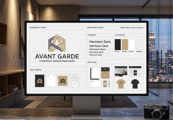
Many business founders fall into the trap of treating a corporate brand identity as a simple checklist item that can be solved with automated, low-cost asset generators. The appeal of a ten-dollar online icon maker is understandable when a company is trying to move fast, but this approach misinterprets what a brand asset actually does on a functional digital interface.
Purchasing an isolated graphic from a generic template warehouse creates an operational dead end. It treats your most visible corporate anchor as an isolated sticker rather than an integrated structural system. This immediate discount comes at the expense of your company's long-term digital conversion efficiency, legal safety, and scaling potential.
A standalone icon is not a brand identity because it lacks context, engineering logic, and market differentiation. When this isolated asset is forced onto a high-performance web application or corporate sales engine, the visual disconnect becomes glaringly obvious to high-value buyers.
The Core Structural Difference: Asset vs. System
An online icon generator delivers a flat graphic asset, usually built on shared vectors that thousands of other entities have already deployed globally. A true corporate brand identity is an interconnected visual system designed to guide user behavior, establish instant market authority, and scale predictably across various viewports.
When you purchase a cheap icon, you receive a single file without any accompanying operational frameworks. It provides no guidance on typography hierarchies, grid alignments, UI component styling, spatial breathing room, or application states.
| Operational Attribute | Cheap Online Icon Generator | Strategic Corporate Brand Identity System |
|---|---|---|
| Legal Exclusivity | Non-exclusive template access; zero trademark viability. | 100% bespoke vector drafting with full IP ownership. |
| Digital UI Integration | Zero consideration for CSS frameworks or UI component scaling. | Native coordination with production-ready style sheets. |
| Scale Performance | Visual degradation or layout breaking when compressed. | Programmatic optimization from 16px favicons to massive scales. |
| Market Positioning | Generic, derivative styling that mimics existing competitors. | Engineered directly around verified buyer persona deficits. |
| Development Readiness | Raw, unoptimized source files with chaotic layer paths. | Clean, semantic asset files engineered for speed-first integration. |
+-------------------------------+           +-------------------------------+
|   Path A: Cheap Online Icon   |           | Path B: Strategic Brand System|
+-------------------------------+           +-------------------------------+
                |                                           |
                v                                           v
+-------------------------------+           +-------------------------------+
| Template Graphic / Messy Code |           | Bespoke Vectors / Clean CSS   |
                |                                           |
                v                                           v
+-------------------------------+           +-------------------------------+
| UI Disconnect / Tech Bloat    |           | Native UI Alignment / Speed   |
                |                                           |
                v                                           v
+-------------------------------+           +-------------------------------+
| Trust Mismatch / High Bounce  |           | Instant Authority / Buyer Trust|
                |                                           |
                v                                           v
+-------------------------------+           +-------------------------------+
| Accumulating Heavy Design Debt|           | High Conversion / Scalability |
                |                                           |
                v                                           v
+-------------------------------+           +-------------------------------+
|   EXPENSIVE FUTURE REBRAND    |           |  PROFITABLE LONG-TERM GROWTH  |
+-------------------------------+           +-------------------------------+
A comprehensive brand system dictates exactly how your company communicates its value proposition without words. It defines how a user reads through your pricing metrics, how a layout shifts on a smartphone interface, and how interactive components respond when a prospective buyer hovers over a primary call to action.
Technical Liabilities of Template-Generated Graphics
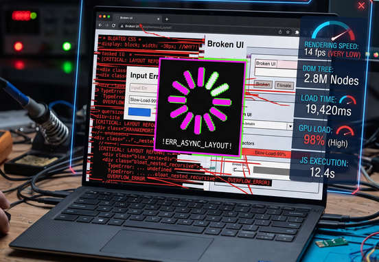
From a pure systems engineering perspective, automated icon generators produce fundamentally messy source code. These platforms auto-generate SVG files by stacking pre-made shapes, resulting in redundant paths, invisible clipping masks, and bloated file sizes that directly harm your core server infrastructure.
When these unoptimized files are embedded directly into a modern website header, they introduce technical friction that compromises layout stability. Code bloat in your global navigation elements directly contributes to layout shifts and delays in interactive performance, harming the overall user experience.
To maintain perfect structural integrity, a web application requires custom asset production. For businesses seeking to maximize their digital returns, pairing a custom identity system with a professional speed-first web design service ensures that your visual assets load instantly without degrading your Core Web Vitals or triggering unexpected layout shifts.
Clean, hand-coded visual systems make a measurable impact on performance. Consider the following example of how a professional identity architecture organizes core variables cleanly inside a production stylesheet, compared to the thousands of lines of inline junk code generated by a cheap template tool:
:root {
  --brand-primary: #0f172a;
  --brand-secondary: #2563eb;
  --brand-accent: #f59e0b;
  --typography-heading: 'Inter', system-ui, sans-serif;
  --icon-bounds-desktop: 48px;
  --icon-bounds-mobile: 32px;
  --ui-transition-smooth: all 0.2s ease-in-out;
}
This clean approach allows front-end developers to map your identity across thousands of unique landing pages globally with absolute consistency. A cheap template asset cannot offer this level of technical standardization, forcing developers to waste costly billable hours writing messy overrides just to make a generic graphic fit your application architecture.
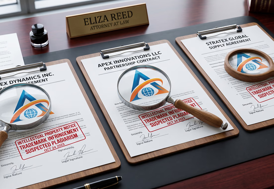
Trademark Vulnerabilities and Legal Exposure
A hidden threat of using low-cost icon engines is the absolute lack of legal ownership. When you pay a budget website for an automated graphic, you are not buying exclusive intellectual property rights; you are merely licensing a generic combination of public shapes.
This means a direct competitor in your exact regional market can use the exact same icon layout, change the hex code slightly, and operate with a virtually identical visual marker. You have zero legal recourse to stop them because you do not hold an exclusive trademark on those shared vector components.
- This lack of exclusivity completely derails your foundational growth, complicating your long-term market authority.
- It can cause major identity issues when attempting to secure high-value domains, creating massive friction if your visual presence conflicts with established organizations.
- It dilutes your overall visibility on search engine results pages by making your business look like an unverified, generic entity.
Establishing clear operational foundations requires aligning your structural choices from day one. Before committing your visual architecture to code, it is critical to focus on selecting a brand name with a trustworthy .com domain to protect your corporate identity and ensure long-term digital search visibility.
How Visual Inconsistency Destroys Website Conversion Rates
Modern buyers are highly attuned to digital trust signals, often spotting design shortcuts in seconds. When an enterprise-grade buyer lands on a business website that features a cheap, automated icon, an immediate psychological mismatch occurs.
If your marketing copy promises high-ticket, institutional-grade consulting or premium enterprise software, but your primary visual asset looks like a five-dollar clip-art piece, user skepticism spikes instantly. This visual friction directly undermines your value propositions and causes users to abandon your conversion funnels.
The Breakdown of Trust across UI Touchpoints
A real identity framework ensures that every element speaks the same design language. When you rely on a cheap icon maker, that cohesion breaks down immediately across critical digital touchpoints:
- The Favicon Mismatch: The automated graphic becomes completely unreadable when downscaled to a 16-pixel browser tab icon, turning into an unidentifiable, pixelated blob.
- The Typography Disconnect: The font bundled with a cheap icon generator rarely matches your website's interface typography, creating distracting visual conflicts across headers and subheadings.
- The Color Space Failure: Generic digital generators create assets without testing how their underlying palettes look across varied screen types, leading to accessibility issues and poor color contrast.
To bypass these conversion hurdles, you must establish clear rules for user experience design. Investing in a strategic color palette choice builds immediate subconscious authority, encouraging deeper user engagement and lowering bounce rates across your core landing pages.
Eliminating Typography Disconnects
The choice of font styles surrounding your corporate mark carries immense weight. Cheap tools throw generic, unoptimized Google fonts together without calculating readability or proportional scale.
A dedicated design system relies on impactful corporate typography to reinforce your market value, establishing a clear visual hierarchy that helps users easily process technical information, pricing plans, and case studies.
Corporate Strategy Tip: Never evaluate a corporate mark in isolation on a blank white canvas. Always stress-test your visual identity inside a high-fidelity browser mockup alongside active user interface elements, application forms, navigation systems, and varying background contrasts. If the asset loses its clarity or makes the layout look unprofessional, it will actively drive away high-value customer acquisitions.
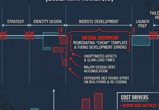
The Design Debt Trait: Financial Realities of Cheap Shortcuts
Opting for a cheap online icon is rarely a true cost-saving measure; it is simply a deferral of inevitable design debt. As your company captures market share and expands its operational footprint, the limitations of a budget asset will eventually force a complete visual overhaul.
Rebranding a company after it has launched is an expensive logistical headache. You will be forced to systematically track down and replace that generic asset across every touchpoint:
- Live web applications, secure portals, and micro-sites.
- Sales decks, investor presentations, and legal agreements.
- Social media profiles, local directory networks, and metadata graphs.
- Digital ad campaigns, corporate video assets, and print materials.
The billable hours required to patch up a fragmented visual identity far outweigh the initial cost of building a professional system from day one. This pattern mirrors the exact hidden financial costs of DIY templates, where cheap shortcuts create technical liabilities that restrict a company's ability to scale.
Designing for Longevity and Scalability
A bespoke visual system is engineered to adapt. It includes clear variations for horizontal configurations, stacked layouts, monochrome environments, and dark-mode application interfaces.
This flexibility ensures your brand remains visually consistent whether it is displayed on an internal software dashboard, a physical product package, or a compressed mobile navigation bar. It protects your brand equity and ensures your company looks authoritative at every scale.
By choosing custom, engineered design frameworks over automated asset generators, you protect your business from looking generic, eliminate technical debt, and build a cohesive web experience that converts casual visitors into long-term enterprise clients.