How Typography and Font Choices Impact Your Brand's Perceived Value and Website Design
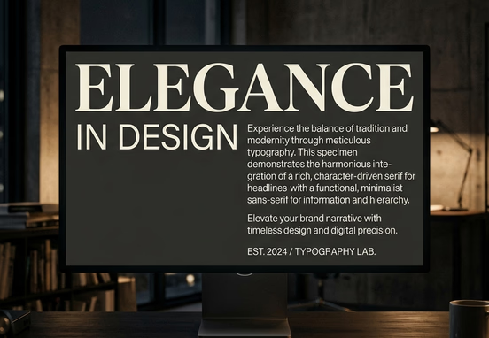
Typography is the primary medium through which your brand's core values, market positioning, and intellectual authority are transmitted across digital interfaces. More than ninety percent of all information on the web exists as written text, making font selection one of the most significant strategic decisions in corporate platform architecture. Many founders treat font configuration as a minor stylistic task, choosing trending typefaces based on casual design preferences. This superficial approach introduces severe performance overhead, degrades user readability, and dilutes your company's perceived value before a single word of your marketing copy is digested.
When an enterprise chooses an unoptimized typographic presentation, it creates a subtle layer of cognitive friction that changes how consumers view the brand. A premium pricing structure cannot be justified by an interface that uses generic, poorly tracked web fonts or clashing typographic weights. This visual misalignment signals to high-value prospects that your operation lacks polish, causing them to exit your platform early. Examining the vast differences between tailored enterprise platforms and restrictive options like Google Sites illustrates how relying on zero-cost, template-driven builders actively compromises your digital market presence. Treating typography as a critical element of your conversion architecture is essential for building deep brand authority and ensuring your digital channels capture market share effectively.
Implementing a highly disciplined typographic framework requires balancing visual brand psychology with strict front-end performance engineering. By selecting highly legible font pairings and loading them through lean asset delivery pipelines, you optimize both user engagement metrics and search engine crawling speed. This strategic engineering approach transforms your text blocks from passive design elements into high-performance conversion tools that maximize customer retention.
The Cognitive Psychology of Typographic Weights
The human brain processes written text on two distinct levels: the literal semantic meaning of the words and the subconscious emotional impression created by the visual letterforms. The geometry, weight, and spacing of your chosen typefaces serve as visual cues that tell the reader how to interpret your brand's legitimacy. Selecting an inappropriate font pairing can actively conflict with your core value proposition, creating cognitive dissonance that reduces conversion rates.
For instance, an enterprise security company or a corporate litigation firm requires a typographic structure that conveys absolute stability, historical permanence, and structural resilience. Utilizing heavy, geometric serif fonts or sharp, highly engineered grotesques communicates authority natively. Conversely, using soft, rounded, or excessively expressive typefaces in these industries would undermine the serious nature of the services, causing potential clients to question your real-world capabilities.
A cohesive visual presentation must be designed intentionally from the foundation of your brand identity. Relying on generic, mass-market shortcuts is highly counterproductive; understanding why a cheap online icon is not enough to build a real brand identity reveals how superficial design asset selections actively degrade corporate trust and long-term market positioning.

The Performance Cost of Unoptimized Typefaces
Amateur developers and mass-market templates frequently load multiple uncoordinated web font files from external servers, completely ignoring the technical impact on browser rendering speeds. Every unique font family, weight variant, and localized character set requires a separate file download that blocks the browser's main thread during the initial rendering phase. This code weight triggers severe latency metrics that hurt your search visibility.
When a website forces a mobile device to download megabytes of custom type files over a standard wireless connection, it tanks critical performance marks. This performance degradation directly lowers your search engine positions, a technical reality detailed in our guide on Core Web Vitals and page speed vulnerabilities, which demonstrates how infrastructure lag damages regional customer acquisition. Transitioning to custom font loading strategies eliminates these technical bottlenecks, protecting your digital marketing returns.
Quantitative Matrix of Typographic Classification Metrics
To build a high-performance corporate platform, your leadership team must evaluate how different font structures affect reader engagement and overall processing speeds. Selecting the right typographic framework balances brand representation with absolute user comfort.
| Typographic Classification | Visual Style & Structural Geometry | Subconscious Emotional Signals | Optimal Enterprise Industry | Technical Performance Profiles |
|---|---|---|---|---|
| Traditional Transitional Serif | Strong contrast, structured brackets, sharp vertical axes | Permanent authority, elite pedigree, institutional trust | Asset management, premium legal counsel, corporate compliance | Requires precise anti-aliasing to prevent letter blur on screens |
| Modern Geometric Sans-Serif | Pure circular forms, uniform line widths, minimalist structure | Forward-thinking innovation, absolute clarity, clean efficiency | Enterprise SaaS, global logistics, data analytics platforms | Highly performant; parses quickly across lower-tier mobile networks |
| Premium Humanist Sans | Subtle organic curves, open counters, high readability | Approachable expertise, human-centric focus, operational empathy | Corporate healthcare, human capital firms, consumer finance | Outstanding scalability; maintains text legibility at small sizes |
| Bespoke Custom Display | High stylistic distinction, unique structural cuts | Absolute exclusivity, cutting-edge luxury, strong leadership | Elite luxury real estate, boutique investment banks | Must be restricted to major headings to avoid loading heavy file assets |
Optimizing Layout Readability: Spacing, Scale, and Math
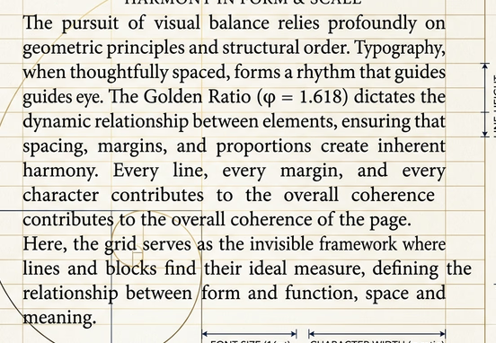
The legibility of your written content is dictated by precise geometric relationships between font sizes, line heights, and paragraph column widths. If your line height is compressed too tightly, text rows bleed together, forcing the reader's eye to struggle to track sentences. Conversely, if your line heights are spaced too widely, paragraphs lose their structural cohesion, breaking the user's focus during long reading sessions.
To ensure comfortable reading across all screen viewports, your development teams must implement fluid typographic scales calculated using relative sizing units (rem) rather than absolute pixel dimensions (px). This engineering standard allows your text elements to adapt naturally to individual user browser settings without causing content overlaps.
- Establish the Baseline Body Text: Define a highly legible core text size, typically between 16px and 18px on desktop displays, to serve as your layout baseline ($1\text{rem}$).
- Apply the Geometric Line-Height Ratio: Set body text line spacing between $1.5$ and $1.618$ (the Golden Ratio) to give individual letters plenty of breathing room.
- Control the Character Line Length: Limit paragraph column widths to between 45 and 75 characters per line, preventing horizontal eye fatigue as users read across the screen.
- Scale the Heading Hierarchies: Use an explicit typographic scale factor (such as $1.25$ or $1.333$) to calculate heading dimensions sequentially, creating a highly organized visual map.
Deploying Variable Font Technology
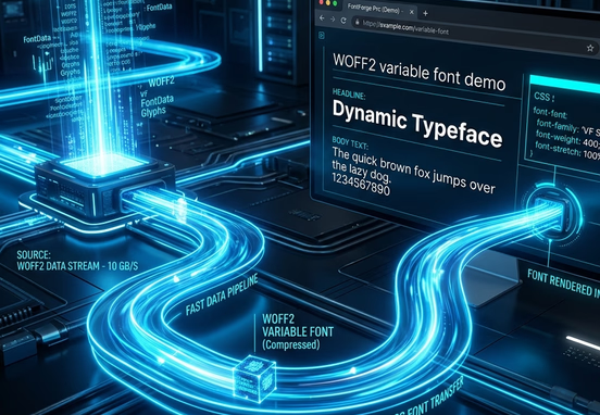
A highly effective strategy for optimizing front-end performance is the deployment of variable fonts. Unlike traditional font files that require a separate download for every single weight variant (Regular, Medium, Semi-Bold, Bold), a variable font contains your entire typographic ecosystem inside a single, highly compressed file asset. This allows your design teams to utilize infinite font variations without adding extra code weight to your platform.
Utilizing optimized front-end systems removes this technical overhead completely. Custom architecture runs directly on the server without needing heavy third-party plugins or subscription platforms. Choosing an enterprise-grade clean, hand-coded web architecture over page builders ensures your platforms load instantly, remain highly secure, and scale smoothly without ongoing software conflicts.
Technical Execution of Font Delivery Pipelines
To ensure your typography renders instantly without causing layout shifts, your engineering teams must configure custom font delivery rules within your global stylesheets. Failing to optimize these loading rules causes a visual bug known as Flash of Unstyled Text (FOUT), where the browser displays a generic system font temporarily before your custom face snaps into view, causing frustrating content movements.
To eliminate this visual shift, you must use the font-display: swap; descriptor within your font-face code blocks. This tells the browser to show a matching local system font immediately during the initial page paint, then swap in your custom typeface smoothly once the file download completes. For an enterprise application, your font declarations should look like this:
+-------------------------------------------------------+
|                Browser Requests Web Page              |
+-------------------------------------------------------+
                            │
                            ▼
+-------------------------------------------------------+
|         Parse CSS Rules (@font-face & body)            |
+-------------------------------------------------------+
                            │
                            ▼
+-------------------------------------------------------+
|        Detect 'font-display: swap' Instruction         |
+-------------------------------------------------------+
                            │
                            ▼
+-------------------------------------------------------+
|      Immediate Paint: Render Local System Font        |
|   (-apple-system, Segoe UI, Roboto, Helvetica...)     |
+-------------------------------------------------------+
                            │
                            ▼
+-------------------------------------------------------+
|        Download Compressed Variable WOFF2 Asset       |
|      (Fetches native weights 100-900 in 1 file)       |
+-------------------------------------------------------+
                            │
                            ▼
+-------------------------------------------------------+
|       Seamlessly Swap to Custom 'EnterpriseSans'      |
|        (Eliminates Cumulative Layout Shifts)          |
+-------------------------------------------------------+
                            │
                            ▼
+-------------------------------------------------------+
|          Apply High-Fidelity Text Rendering           |
|     (optimizeLegibility & antialiased edges)          |
+-------------------------------------------------------+
This disciplined code implementation ensures that your brand typography renders consistently across all mobile screen widths, eliminating visual bugs and maintaining a premium user experience.
The Spatial Connection: Color Theory and Reading Environments
The relationship between your typography and your color palette dictates long-term user comfort and overall accessibility compliance. Text elements that lack sufficient color contrast against their backgrounds make content completely unreadable for large user segments, creating serious operational bottlenecks.
To maintain professional readability standards, your interface elements must adhere strictly to the Web Content Accessibility Guidelines (WCAG), which mandate precise contrast ratios for all written content. Combining an expert typographic scale with an intentional, trust-centered color scheme is an essential step for building an authoritative platform. Reviewing how to balance these visual layers across the psychology of color palettes that build trust ensures your interface remains fully accessible while reinforcing your brand authority.
Furthermore, ensuring your text structures guide the user naturally down the page is critical for maximizing conversion rates. Every font selection must support your primary value propositions; pairing an expert typographic layout with high-converting website copy architecture ensures your text blocks engage high-intent users and drive transactional decisions smoothly.
Typographic Governance Mandate: Never allow automated website generators or entry-level templates to dictate your platform's typographic rules. Every typeface selection, font weight distribution, and line-height scale must be defined within a centralized design system and tested across multiple physical devices to ensure perfect rendering and absolute accessibility compliance.
Securing expert engineering ensures your digital assets remain fast, secure, and perfectly tailored to your target consumer journeys. Our professional web design and development services are built to remove technical bloat and deliver highly polished custom applications. Investing in premium development allows your company to bypass generic template limitations, secure full ownership of your source code, and build a resilient digital presence that drives sustainable, long-term market growth.