

How B2B vs B2C Positioning Changes Your Website Layout Strategy
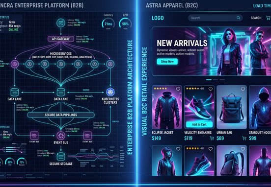
A website layout is not merely an aesthetic container; it is the structural blueprint of your commercial sales cycle. If your user interface architecture fails to mirror the psychological journey of your specific audience, your digital asset will consistently lose high-value conversions. The core operational divergence between Business-to-Business (B2B) and Business-to-Consumer (B2C) web models requires completely different page structures, content hierarchies, and interactive routing pathways.
B2B layouts are engineered to facilitate multi-stakeholder evaluation, minimize perceived risk, and nurture long-term transactional consensus. Conversely, B2C layouts are designed for transactional velocity, leveraging immediate emotional triggers, visual immersion, and frictionless path-to-purchase flows. Applying a B2C template framework to a B2B offering, or vice versa, destroys conversion rates by misaligning with user intent profiles.
To design an interface that turns traffic into revenue, you must examine how positioning dictates screen real estate. Every structural block, from hero sections down to footer layouts, must serve the precise informational requirements of your specific audience type. Understanding these structural differences shifts your web architecture from a basic visual presentation into a targeted business generation engine.
Psychology of the Click: Transactional Velocity vs. Stakeholder Consensus
The primary differentiator between B2B and B2C layout strategy is the complexity of the underlying purchasing decision. B2C users typically buy on emotion, individual preference, or immediate physical necessity. The transaction window is short, often lasting only a few minutes. Therefore, a B2C layout must clear away all cognitive processing barriers between the initial homepage arrival and the final checkout page click.
B2B purchasing, however, involves high-ticket pricing, long contract terms, and a committee of corporate decision-makers, including procurement officers, technical directors, and legal compliance teams. The layout must serve as an information hub that provides each distinct stakeholder with the specific technical data, security certifications, and financial ROI models needed to approve the transaction.
To capture these distinct audiences, your design process must start by mapping out exact consumer profiles. Reviewing our tactical guide on how to build a buyer persona to identify your perfect target client provides your development team with the precise framework needed to align your page architecture with real-world user intent profiles before writing code.
B2B Information Architecture and Content Staging
Because a B2B buyer requires substantial proof before making contact, the information layout must feature a clear, deep content hierarchy. The hero area should avoid broad, vague taglines and focus immediately on an enterprise-grade value statement. Navigation headers must prioritize structural educational elements, such as case studies, technical documentation, whitepapers, and integration capabilities.
The page layout should guide the user through an intentional, educational journey. Instead of pushing for an immediate sale right below the hero section, a B2B page stages its conversions. It offers low-friction micro-conversions, like downloading a technical specifications report, midway down the page, reserving high-friction macros, like scheduling an enterprise API demonstration, for the bottom section after building authority.
Structuring this content journey requires an intentional approach to formatting your text, subheadings, and messaging blocks. Mastering the core principles of how to write high-converting website copyheadlines value propositions and about us pages that build trust ensures that your layout structures work in absolute harmony with your messaging, guiding stakeholders toward a conversion with clean, professional authority.
B2C Friction Reduction and Empathy Structuring
B2C layouts require a completely opposite visual strategy. A B2C visitor has a low tolerance for dense paragraphs of text, technical jargon, or complex navigation systems. The layout must rely heavily on high-impact visual presentation, prominent product photography, dynamic pricing elements, and immediate, single-click purchase calls to action.
The navigation menu should be incredibly flat and category-driven, allowing users to filter products by size, color, price, or availability with minimal taps. Every extra step, mandatory account creation screen, or confusing form field within a B2C checkout pathway acts as a direct point of abandonment, driving up bounce rates and leaking revenue to competitors.
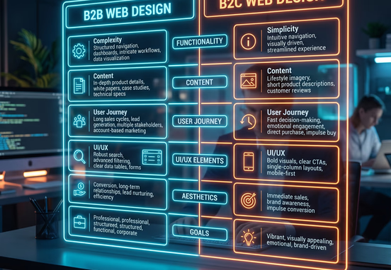
Structural Comparison Matrix: B2B vs. B2C Layouts
The table below provides a comprehensive breakdown of how specific web page sections change structurally based on whether you are positioning for an enterprise B2B or consumer-facing B2C audience:
| Page Layout Component | B2B Enterprise Architecture | B2C Consumer Framework |
|---|---|---|
| Hero Section Priority | Direct, clear corporate value statements and primary problem resolution messaging. | High-impact product visuals, seasonal promotional banners, and direct shopping paths. |
| Primary Call to Action | High-touch consultation requests, custom quote forms, or live software demo scheduling. | Quick transactional links, "Add to Cart" functions, or immediate coupon claims. |
| Navigation Framework | Deep, educational sub-menus focused on feature sets, industries, and resources. | Flat, highly visual category matrices utilizing direct product sorting filters. |
| Trust Signalling Methods | Detailed corporate case studies, verified ROI calculators, and industry compliance seals. | Star rating aggregates, real-time customer review sliders, and unboxing video loops. |
| Checkout/Form Lifecycle | Multi-step qualification fields designed to filter out unqualified business accounts. | Single-page guest checkout systems optimized for digital wallets and mobile apps. |
| Content Density Profile | High density of technical documentation, data sheets, and long-form case evaluations. | Low text density dominated by quick benefit bullet points and lifestyle imagery. |
Engineering the B2B Conversion Funnel: Trust and Education Architecture
A successful B2B layout functions as a silent, digital account executive. It must address common corporate objections, validate technological security frameworks, and make it simple for an internal project champion to export your value propositions to their executive board. This requires a clean, professional, and highly organized presentation of data.
The layout must feature clear typographic contrast, generous white space to make complex data readable, and dedicated sections for professional proof. By organizing case studies into clear problem-solution-result frameworks, you show corporate buyers that your platform understands their specific operational constraints and has a proven track record of delivering measurable financial returns.
Case Studies, Technical Specs, and Multi-Step Lead Routing
When a B2B user arrives at your service page, they need to verify that your solution integrates seamlessly with their existing enterprise software stack. A dedicated section highlighting API documentation, data encryption layers, and system compliance standards should be visible and easy to find within your page structure.
Furthermore, your lead capture forms must be engineered to qualify incoming traffic. While a B2C form aims for maximum simplicity, a B2B form intentionally introduces controlled friction. By asking for corporate email addresses, company sizing metrics, and specific operational pain points, you ensure your sales team spends their high-value hours exclusively on highly qualified enterprise accounts.

Engineering the B2C Conversion Funnel: Speed, Social Proof, and Direct Transactional Flow
B2C conversion engineering centers entirely on minimizing cognitive load. When a consumer lands on a retail or direct-to-consumer page, their eye must be drawn directly to the primary product asset through strong visual contrast, strategic color palettes, and intuitive element placement. Secondary informational items must be placed lower down the page structure.
Social proof must be embedded directly into the primary viewing frame. Placing review counts and user-generated content right below the product title validates the buyer's impulse, reducing purchase anxiety in real time. If a user has to search your site to find customer feedback, your layout is introducing unnecessary conversion friction.
Overcoming Banner Blindness and Streamlining Visual Paths
Modern consumers have developed a subconscious filter known as banner blindness, causing them to completely ignore elements that resemble generic ads, superficial stock banners, or aggressive promotional blocks. To cut through this digital noise, your layout must feature authentic, unique visual assets that flow naturally within your page hierarchy.
Every interface element must be optimized using clear psychological layout principles to guide user attention smoothly toward your conversion goals. Reviewing how to build high-converting landing pages ux mistakes banner blindness and psychological principles provides your team with a clear blueprint for removing visual clutter and keeping users focused on your core calls to action.
Conversion Engineering Tip: Always track your layout's mobile performance on actual mobile hardware, not just desktop browser emulators. A multi-column desktop layout that looks beautiful on a high-resolution display can easily degrade into an endless, exhausting vertical scroll on a smartphone screen, destroying your B2C mobile conversion rates instantly.
When your page elements are unoptimized, your user retention drops, which directly increases your overall marketing expenses. Understanding how great user experience lowers customer acquisition costs explains how strategic layout choices directly reduce user drop-offs, helping you secure a much higher return on your digital marketing spend.

Technical Execution: Deploying the Right Layout Infrastructure
Whether you are building a deep information hub for an enterprise B2B platform or a fast checkout pipeline for a consumer brand, the underlying technical infrastructure of your site determines your ultimate performance ceiling. Heavy templates and bloated plugin configurations introduce code errors that slow down page speeds and ruin mobile responsiveness.
To maximize your online performance, your digital platform must be built on optimized, lightweight code frameworks. Investing in a professional speed-first web design and development service gives your brand a high-speed, hand-coded site layout engineered for fast content rendering and technical SEO authority. This clean development path ensures your pages load almost instantly on mobile devices, capturing high-intent traffic before users lose interest.
Furthermore, a clean code structure allows your developers to configure exact responsive layouts without relying on heavy layout builders. For example, instead of loading a massive grid framework to handle B2B versus B2C card structures, developers can write clean, semantic styling definitions directly into your stylesheets to manage layouts efficiently:
       [ Website Traffic Arrival ]
                    │
          ┌─────────┴─────────┐
          ▼                   ▼
    [ B2B Funnel ]      [ B2C Funnel ]
          │                   │
          ▼                   ▼
    [ Enterprise ]      [ Emotional/Visual ]
    [ Value Statement ] [ Product Hero Area]
          │                   │
          ▼                   ▼
    [ Deep Content ]    [ Flat Categories  ]
    [ Case Studies ]    [ Dynamic Filters  ]
          │                   │
          ▼                   ▼
    [ Qualified Lead ]  [ 1-Click Checkout ]
    [ Friction Form  ]  [ Digital Wallets  ]
          │                   │
          ▼                   ▼
    [ Stakeholder ]     [ Transactional    ]
    [ ROI Consensus ]   [ Velocity Success ]
Step-by-Step Layout Strategy Blueprint for Both Models
To execute a successful site redesign or launch a new digital asset that matches your market position, follow this systematic developmental sequence:
- Isolate Your Target Audience Intent: Determine whether your sales cycle requires multi-stakeholder education or immediate emotional validation to map user paths accurately.
- Map the Primary Navigation Pathways: Design a clear information hierarchy that minimizes clicks for B2C shoppers or structures an educational resource journey for B2B buyers.
- Optimize the Visual Layout Hierarchy: Use clear typographic contrast and open white space to guide a user's eye smoothly toward your primary conversion zones.
- Deploy Contextual Trust Signals: Embed detailed corporate case studies for B2B layouts or aggregate user reviews and rating badges for B2C storefronts.
- Streamline the Checkout and Form Flows: Strip out non-essential form fields to lower user friction, ensuring your conversion pipeline matches your sales requirements.
- Audit Mobile Interface Consistency: Test your complete page layouts across multiple active smartphone screens to eliminate rendering bugs and keep your interface highly responsive.
Before finalizing your layout designs, organize your baseline brand metrics, navigation pathways, and operational parameters. Utilizing the ultimate web design project prep guideplanning information architecture content layout and agency creative briefs gives you an organized framework to plan your site layout, ensuring your final platform matches your business goals perfectly.
By matching your website layout to your market positioning, you remove the operational friction that kills online conversions. Investing in a fast, clean, and strategically structured digital presence gives your brand a permanent competitive advantage, allowing you to capture high-value accounts, drive customer engagement, and maximize your market share over the long term.