
100/100 Page Speed Insights Handbook

Step 1: Optimizing Images
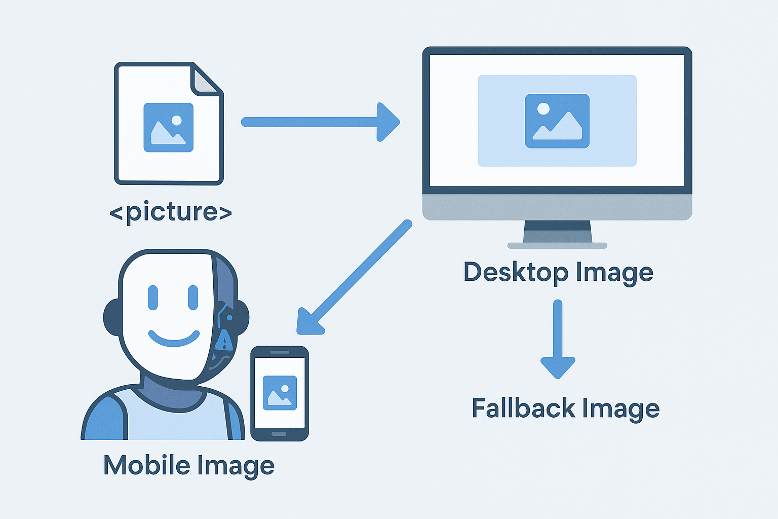
Leveraging the <picture> Element
To serve appropriately sized images across various devices, utilize the <picture> element. This allows you to specify different image sources based on screen width, ensuring optimal loading times.
<picture>
  <!-- Mobile Image -->
  <source media="(max-width: 600px)" srcset="path/to/image-mobile.webp">
  <!-- Desktop Image -->
  <source media="(min-width: 601px)" srcset="path/to/image-desktop.jpg">
  <!-- Fallback Image -->
  <img src="path/to/image-desktop.jpg" alt="Description" width="1920" height="1280" loading="lazy" decoding="async">
</picture>
This setup ensures that mobile users load a smaller, optimized image, significantly improving load times. The <img> tag serves as a fallback for browsers that may not fully support the <picture> element.
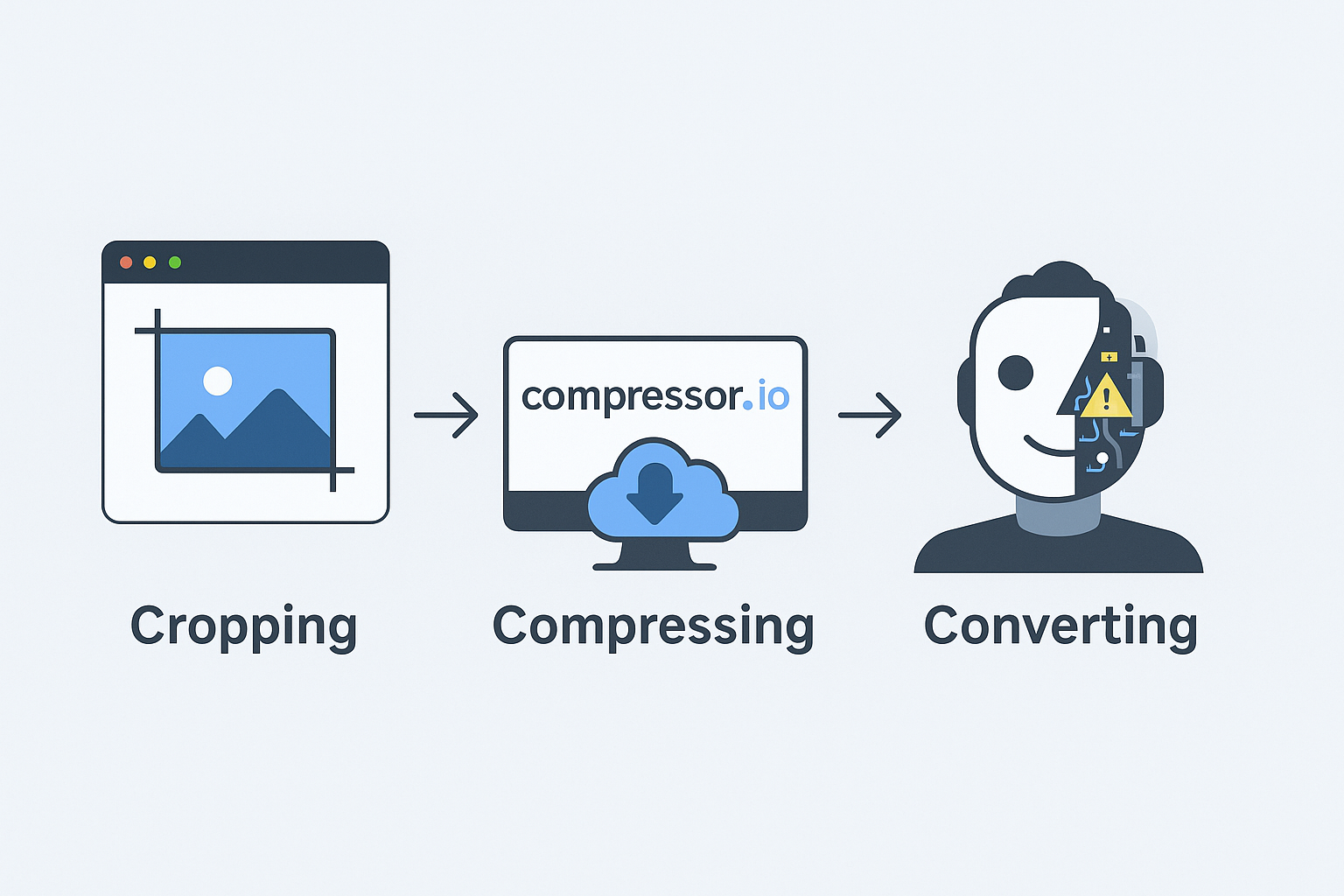
Cropping Images to Display Size
Determine the exact display dimensions of your images using design tools like Figma or Adobe XD. For instance, if an image displays at 551px by 250px on desktop, crop it to double those dimensions (1102px by 500px) to account for high-resolution screens.
On mobile, if the display size is 292px by 213px, crop the image to 584px by 426px. Name mobile versions with a "-m" suffix (e.g., image-m.jpg). This practice reduces file sizes dramatically, enhancing load speeds.
Compressing Images
After cropping, compress your images using tools like Compressor.io to further reduce file sizes without compromising quality. Aim for mobile images between 20-40KB and background images under 100KB.
Converting Images to WEBP Format
Convert images to the WEBP format using services like CloudConvert. WEBP images are approximately 30% smaller than JPEGs and 26% smaller than PNGs, leading to faster load times.
Implementing Lazy Loading
For images below the fold, add the loading="lazy" attribute to defer loading until they're about to enter the viewport. Avoid lazy loading images above the fold to prevent layout shifts.
Asynchronous Image Decoding
Include decoding="async" in your <img> tags to allow the browser to decode images asynchronously, improving performance by not blocking the rendering of other content.
Optimizing Landing Page Images
For mobile, crop the central part of your desktop image to match the width of mobile screens, eliminating unnecessary data and enhancing load times. This is particularly beneficial for landing page images that cannot be lazy-loaded.
Preloading Critical Images
Use the <link rel="preload"> tag in the <head> section to preload essential images, such as logos or above-the-fold visuals, ensuring they're loaded promptly.
<link rel="preload" as="image" href="path/to/critical-image.webp">
Lazy Loading Background Images
Instead of using CSS for background images, incorporate them into your HTML using the <picture> element. This approach allows for lazy loading and asynchronous decoding, enhancing performance.
<section id="cta">
  <div class="container">
    <!-- Content -->
  </div>
  <!-- Background Image -->
  <picture>
    <source media="(max-width: 600px)" srcset="path/to/bg-mobile.webp">
    <source media="(min-width: 601px)" srcset="path/to/bg-desktop.jpg">
    <img src="path/to/bg-desktop.jpg" alt="Background" loading="lazy" decoding="async">
  </picture>
</section>
Apply CSS to position the <picture> element absolutely within the section, ensuring it behaves like a traditional CSS background image.
Step 2: Optimizing Fonts
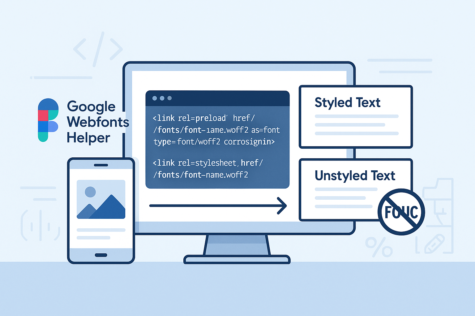
Hosting Fonts Locally
Avoid using Google Fonts via CDN links, as they can slow down your site. Instead, download and host fonts locally using Google Webfonts Helper. This tool allows you to subset fonts, removing unnecessary characters and reducing file sizes significantly.
Preloading Fonts
Preload essential font files in the <head> section to ensure they're available when needed, reducing render-blocking issues.
<link rel="preload" href="/fonts/font-name.woff2" as="font" type="font/woff2" crossorigin>
Preventing Flash of Unstyled Content (FOUC)
To avoid FOUC, set fallback fonts in your CSS that closely match your primary fonts. Use tools like Font Style Matcher to find suitable system fonts and adjust line heights accordingly.
Additional Optimization Techniques
Managing Render-Blocking Scripts
Place render-blocking scripts, such as Google Analytics, at the bottom of the <head> or just before the closing </body> tag to prevent them from delaying page rendering.
Minifying CSS and JavaScript
Minify your CSS and JavaScript files to reduce their size, improving load times. Tools like UglifyJS and CSSNano can assist with this process.
Utilizing SVGs
Use SVGs for icons and simple graphics, as they are scalable and lightweight. Optimize them using tools like SVGOMG to remove unnecessary metadata and reduce file sizes.
Deferring Non-Essential JavaScript
Add the defer attribute to non-critical JavaScript files to postpone their execution until after the HTML has been parsed.
<script defer src="/js/script.js"></script>
Eliminating Unnecessary Third-Party Scripts
Remove third-party scripts like jQuery or Font Awesome if they're not essential. Modern JavaScript can handle many tasks previously reliant on jQuery, and SVGs can replace icon fonts.
Preventing CSS Render-Blocking
Split your CSS into critical and non-critical parts. Load critical CSS inline or in the <head>, and defer non-critical CSS using the media="print" trick.
<link rel="stylesheet" href="/css/critical.css">
<link rel="stylesheet" href="/css/main.css" media="print" onload="this.media='all'; this.onload=null;">
<noscript><link rel="stylesheet" href="/css/main.css"></noscript>
This approach ensures that essential styles load immediately, while the rest load after the page has rendered, improving performance.
Related Posts
Featured Posts


100/100 Page Speed Insights Handbook
5 mins readWhy website speed is important?
8 mins readCustom Website vs WordPress: A Technical Comparison
6 mins read